Use.Space - Brand Identity.An inspirational coworking initiative with community at its heart.
Says what it does, does what it says.
Working closely with founder and creative entrepreneur David Walter, the first step in this project was naming the new coworking initiative, ahead of its completion and opening. With hot desks, private offices, café, garden, meeting rooms and break out spaces, it was to be a space created for individuals and businesses to use, it was to be a ‘Use.Space’. 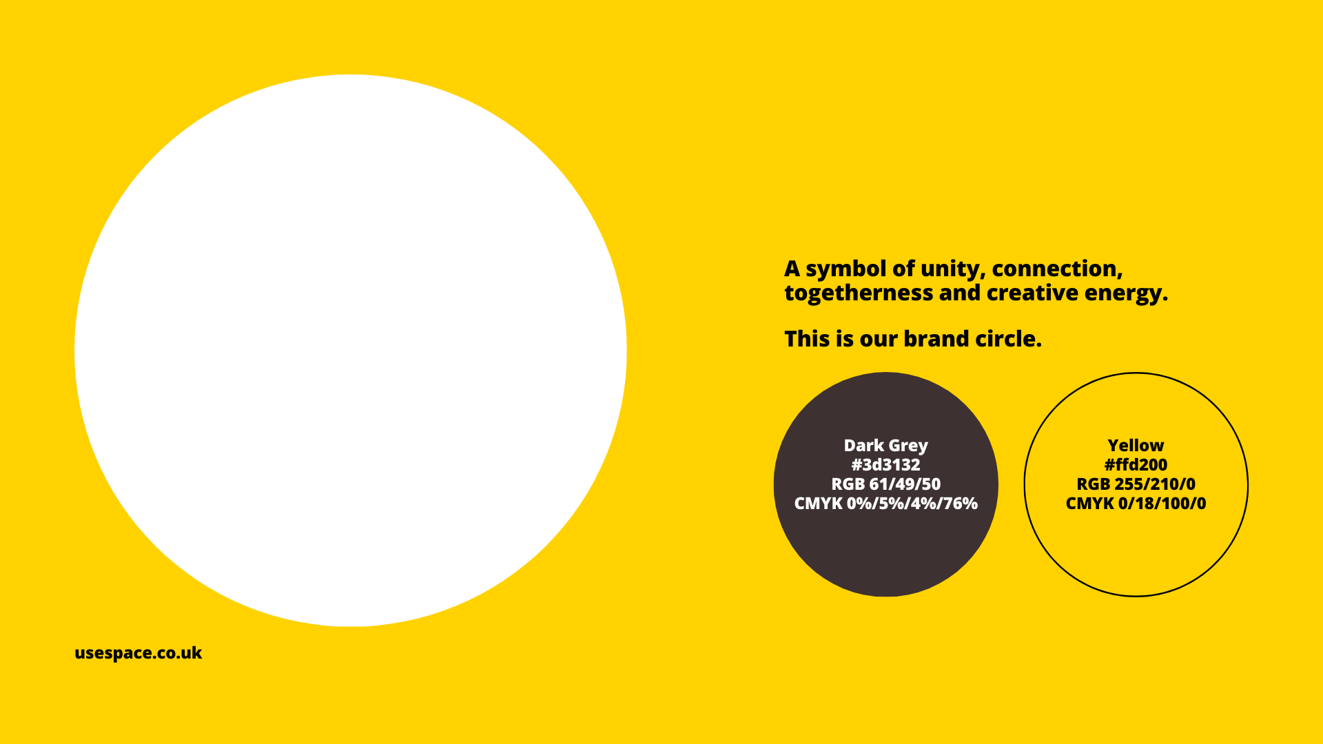
Colour of optimism, symbol of unity.
The name decided upon, next was development of the brand identity. Described by the founder as ‘a place where optimists can thrive’ this independently owned coworking space needed a brand that projected its ethos of support, collaboration, networking and community.The colour of optimism, energy, creativity and joy, yellow was a natural choice as the main brand colour. When teamed with a circle - the symbol of unity, connection and togetherness - they became the core elements of the brand identity.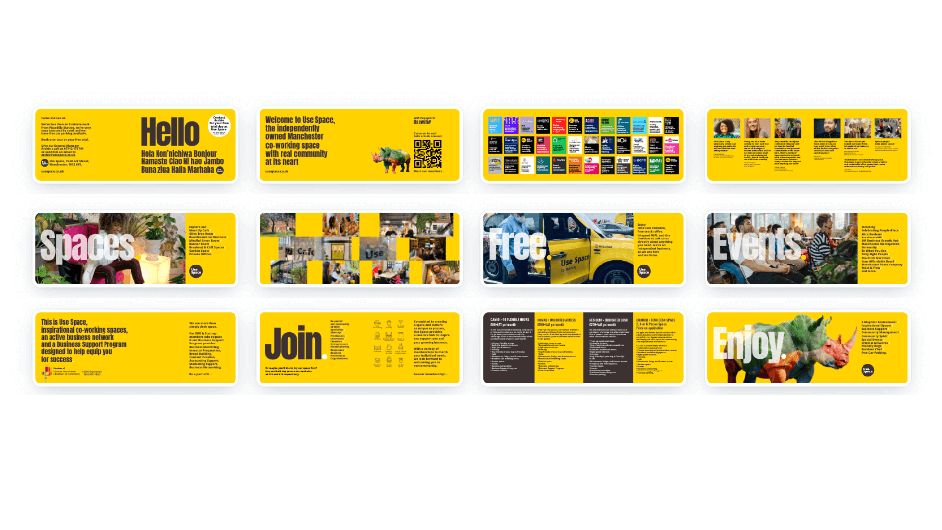
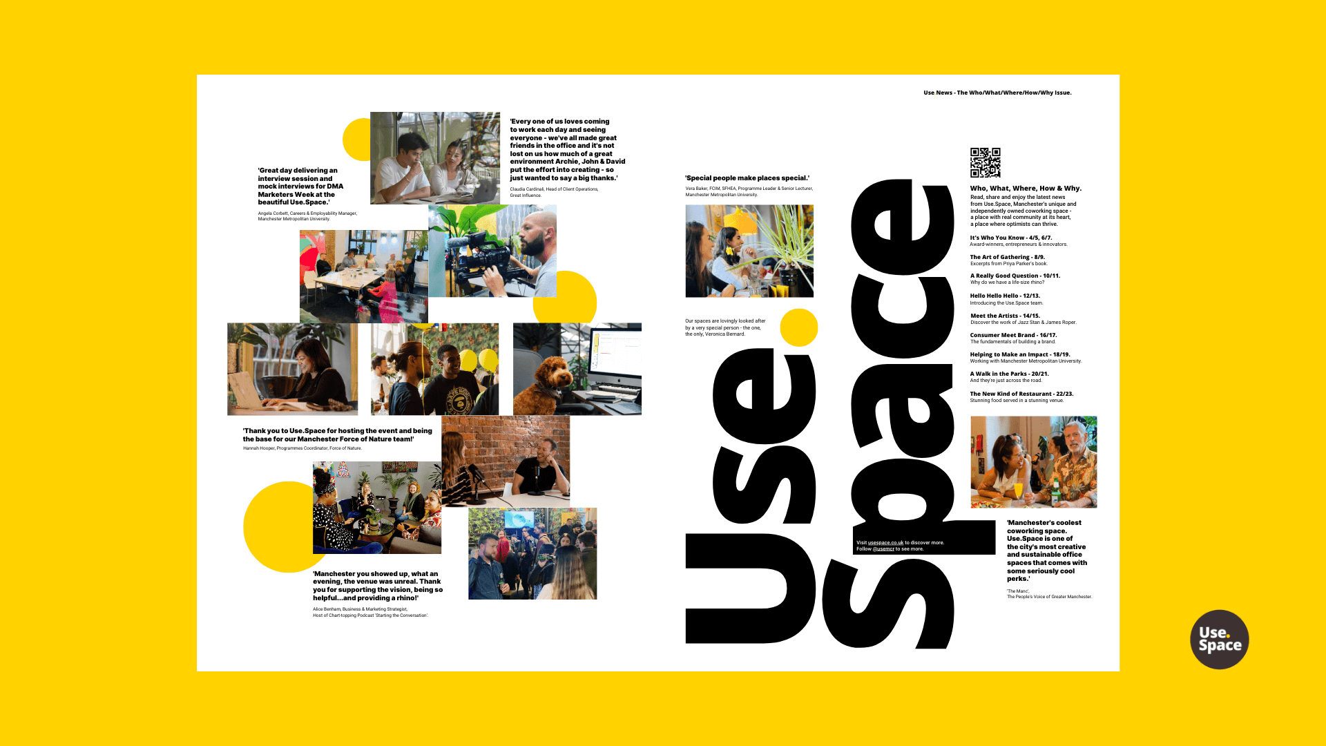
Stories to be told.
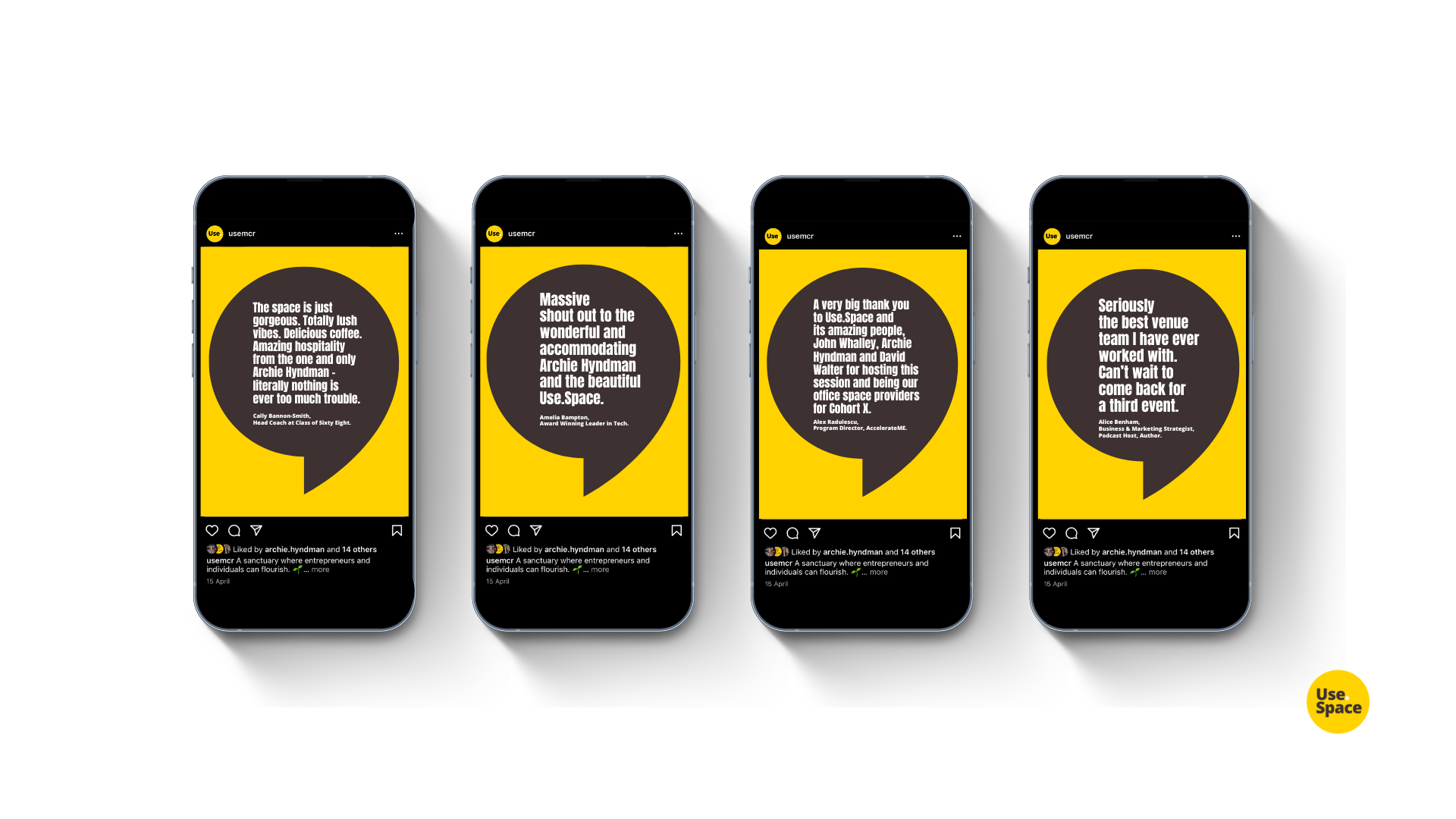
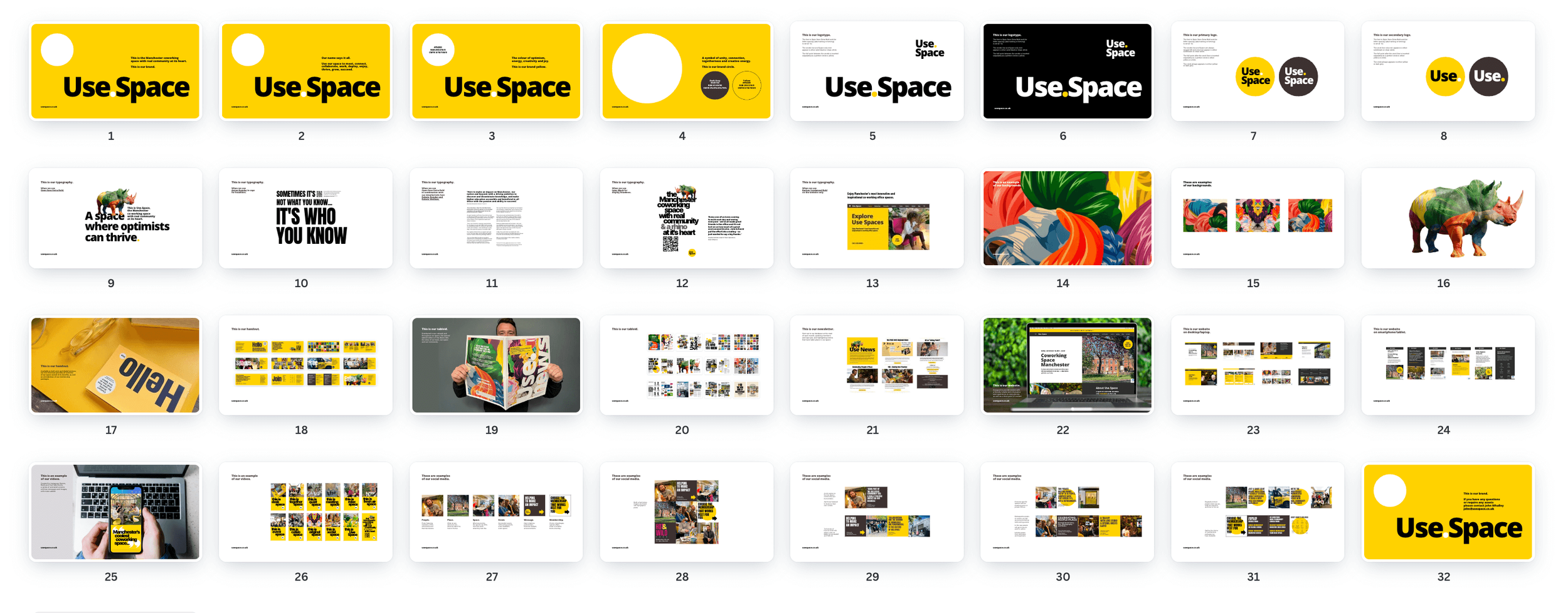
As this inspirational space came to life and the community grew, the introduction of imagery, video content and a bold graphic language created a brand that continues to tell its story with one bright and engaging voice across the built environment, in print, online, and on social channels.